Events & Membership Platform
A dated events & membership platform, rethought and rebuilt in about a month
#Open runs a national network of member clubs and events across the US and Canada — and the platform powering it was a V1-era product held together by workarounds staff had memorized. Treetop Labs was engaged to rethink it, not restyle it. In lockstep with #Open's dev, PM, and analytics teams, we directed the architecture and rebuilt the app from scratch in a little over a month — getting expert-fast by pairing first-principles thinking with AI analysis of real user sessions, layered with interviews.
Role — Product & systems design, research, buildTeam — Treetop Labs + client dev, PM & analyticsSurfaces — Desktop admin, mobile staff, door check-in
Rethinking the product, not restyling it
Veterans had adapted — door staff opened the main navigation twelve or more times per shift just to reach basic actions. The workarounds were fluent, but speed had plateaued years ago. New hires paid the other cost: the product needed extensive shadowing just to become usable at the door.
And the harder problems lived under the styling:
- Dated and desktop-only, in a permanent light theme — brutal on phones at the door, in dark venues past midnight.
- Cryptic icon toolbars with no labels — managers hovered, guessed, then memorized.
- Stacked rich-text editors and forms with no hierarchy between required and optional.
- A check-in view that surfaced every edge case at once.
The brief wasn't a visual refresh. It was a simpler product serving two audiences at once — veterans who already understood the work, and new hires who shouldn't need a week of shadowing to be useful at the door.
So we rethought the patterns, not the paint:
- Labeled actions replaced cryptic icon columns.
- The check-in view shed its edge-case scaffolding and earned dark mode.
- The mental model — members, events, approvals, check-in — stayed; the accidental complexity around it didn't.
Grounding the redesign in usage data
This was no generic admin tool. Its domain modeled couples as first-class entities — two people sharing a membership, a ticket, an approval, a history — so the surfaces that mattered most needed custom information architecture, not off-the-shelf patterns.
The redesign was grounded in how staff actually used the system:
- Surface-by-surface audit — every screen annotated to keep, rework, cut, or rethink.
- Recorded sessions + usage data across four roles (club manager, door manager, membership coordinator, events lead), with NotebookLM as a synthesis partner across hours of video — the judgment on what mattered came from experience, not summarization.
- Competitive analysis of established platforms for patterns that generalize; custom solutions where they didn't.
- Luma
- Eventbrite
- Partiful
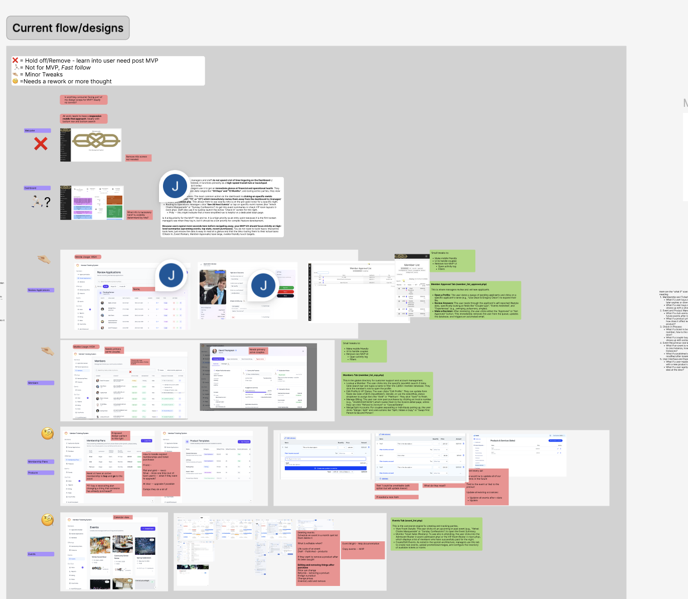
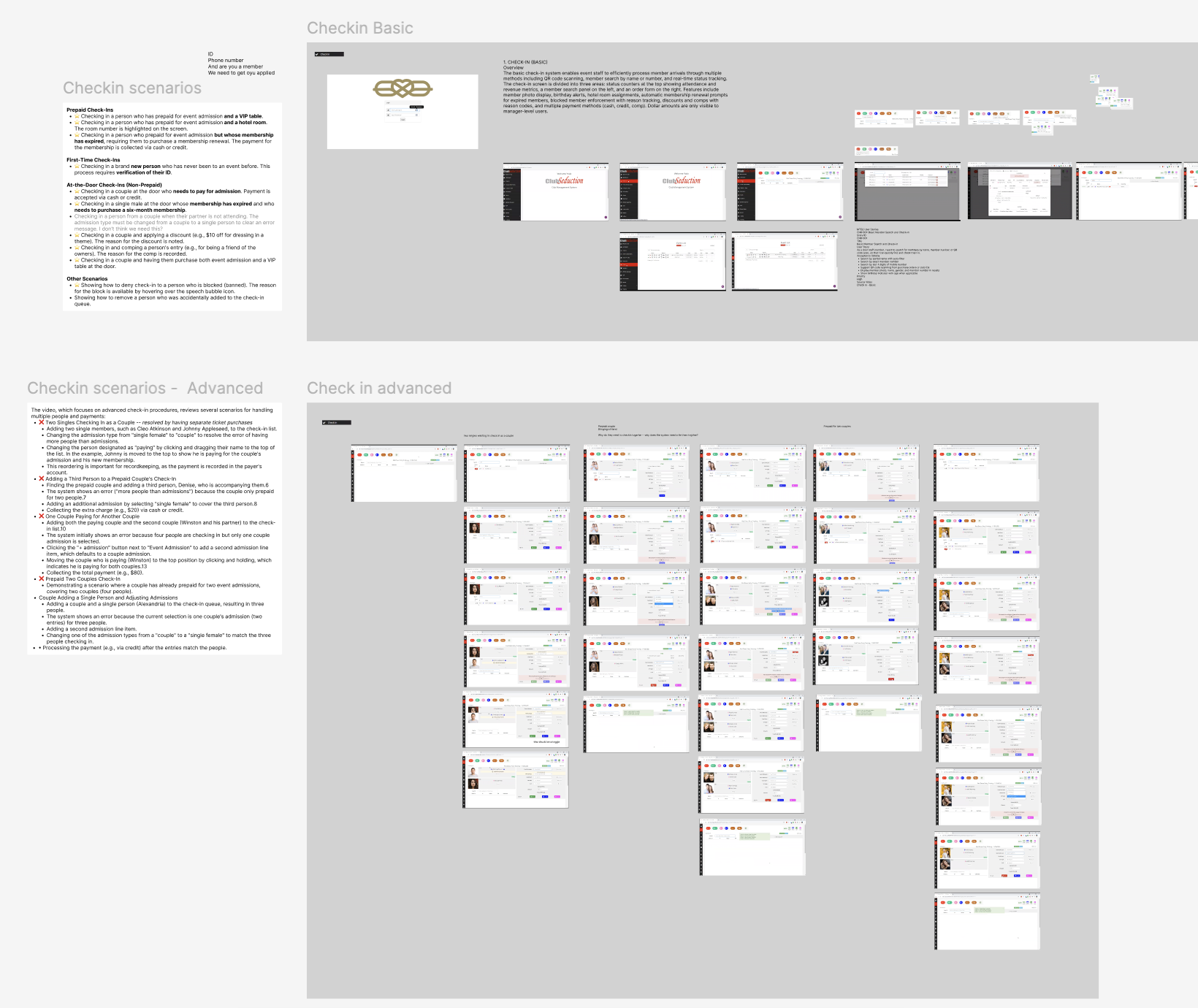
The data settled debates that would otherwise need stakeholder alignment. Revenue was surfaced to managers but hidden at the door — not a policy call, but an observation: door staff never consulted financials; managers did, constantly.
In-app search was prioritized after research showed managers running ten to twenty searches per session. The implementation matches by partner rather than by couple record: searching natagainst a Michael & Natalie record highlights Natalie alone. Michael remains visible as context but is not signalled as a match.
Designing in Claude, refining in Figma
Design ran primarily in Claude Code — not as a coding assistant, but as the design surface itself. A single-file HTML prototype did three jobs at once: the evolving spec, the vehicle for stakeholder review (deployed to Vercel), and the eventual engineering handoff. Figma played a narrower role — higher-fidelity tweaks late, and a shared canvas for PM feedback.
Working this way meant building a shared memory that persisted across sessions. Four documents captured decisions as they locked in:
Every feature followed the same discipline — do not build yet. The core MVP became a ~780-line build spec, pressure-tested before a line of code. From there the build ran in Claude Code, with the client's engineers pulled in for the backend and anything that needed their eyes.
Two decisions show where design judgment did the work AI couldn't:
Partner-level search highlighting
An initial implementation colored the entire couple row when any field matched. It was technically correct but created a false signal — searching for one partner flagged both equally. Scoping the highlight to the matching partner preserved the couple as context without implying Michael was a result when he was not. A small distinction, but one that meaningfully affects how a manager reads the list across ten or twenty searches in a shift.
Add Member as modal, not drawer
The platform uses a right-side drawer for viewing and editing member records. Reusing the same container for member creation was the apparent choice. On review, a centered modal was the better fit: creating a member is a transactional action with a clear start and end, distinct from the contextual, persistent nature of viewing a record. Using one container for both collapses two mental models into a single surface — a pattern that reads as consistency but functions as ambiguity.
What we delivered
- A single-platform designOne coherent system designed to replace fifteen parallel chapter deployments across membership, events, approvals, and door check-in.
- Design systemTypography, spacing, and color tokens in light and dark modes, with a component library mapped directly to the prototype.
- Prototype as specificationAn interactive prototype that doubled as design deliverable and engineering reference, with component-for-component parity to the React build.
- Designed for continuity and clarityBuilt so veterans keep their fluency on the tasks they run most, and new hires can reach useful output at the door without the extended shadowing the old product demanded.
The research shows up on every surface:
- Events as calendar, card, and table views — filter defaults tuned per role.
- View and edit share a layout, so toggling feels continuous, not modal.
- Check-in in persistent dark mode for low-light venues, with revenue scoped by role.
Designed for the door — on a phone.
Door staff run the night from their phones, so the product is fully responsive — the same system rethought for one thumb in a dark venue.
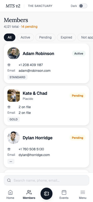
Members, at a glance
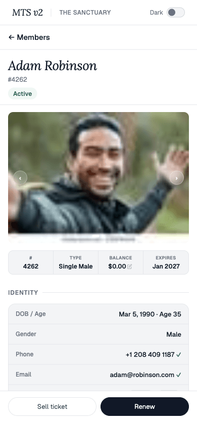
Member detail
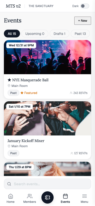
Events
At the door, check-in is three taps — pick the live event, find the guest, and scan to admit.
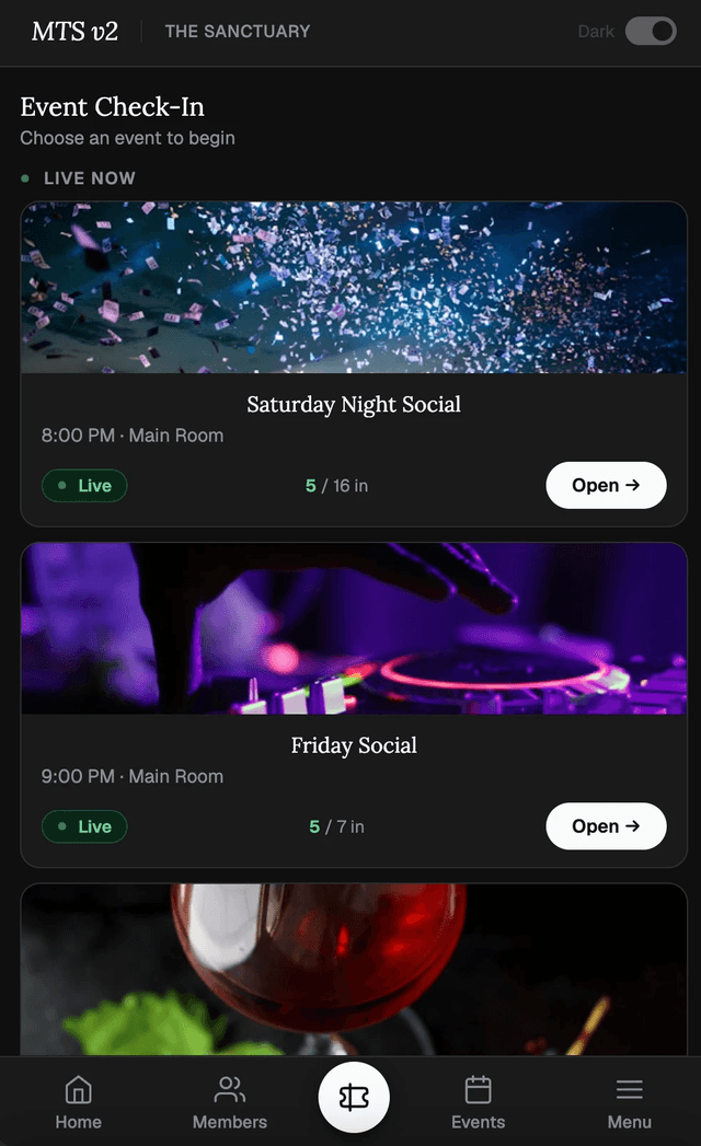
Pick the live event
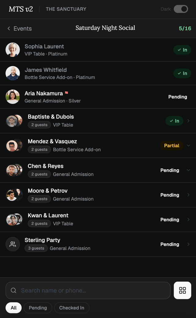
Work the guest list
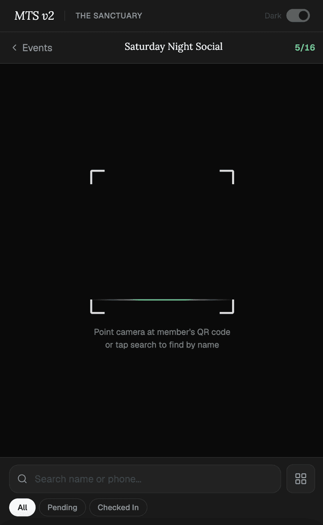
Scan to admit
Treetop Labs partners with teams on design and engineering work of this scope. If you have a platform in need of consolidation, redesign, or replacement, we'd welcome a conversation.
Get in touch →